
Tuesday, December 17, 2013
Flower and Butterfly
Thursday, December 12, 2013
Spot Color - Mega Man N.E.S.
 For this spot color I chose the Mega Man N.E.S. because I thought it would be easy with the pixel areas, however I underestimated it. For this I used the polygon lasso for the pixel areas around Mega Man. When I finished that, I did a control shift I to get the inverse, then I went to the command tab, down to creative, and finally chose gray scale. The bottom picture is the original looks like.
Spot Color - Apples
 For this spot color I chose the apples, because I had an idea about having one type of apple being in color and the others being in a sepia tone. I did what I did with the other spot color pictures and used the polygon lasso went around the green apples, however unlike the other ones I pressed and hold shift to get the other row of green apples. When I got all of them I did control shift I and selected went to the command tab down to creative and chose sepia tone. The bottom picture is what the original was.
Spot color - landscape


Wednesday, December 11, 2013
Spot Color - Rain Tree

 For this spot color I used the lasso tool to try to get only the leaves. This was a difficult task but I was able to get a good amount of the leaves. First I did a rough outline of the leaves with the lasso tool. Then, I did a control shift I to get the inverse. Then I went to the command tab, down the creative area and selected convert to sepia tone. After I did that I tried to get a bet more detail into this by getting any parts that were still not ready. The picture on the bottom is what the picture would look like without the spot color
Friday, December 6, 2013
Jagged Font - Alphabet

Monday, December 2, 2013
Cornucopia
 For my cornucopia I mostly used fall colors for the background and chose a solid golden orange like color for the background. For the horn, I made an outline for the cornucopia, then I took a bunch of circles, used the pen tool, and then used the sub select tool tool make the circles look more like a horn. I also made a lighter brown circle to look like the opening for the horn. I started with apples for fruit, I made a circle, used the pen tool, then the sub select tool, added a stem and then duplicated the apple and stem and then grouped them together. For corn I rounded a rectangle then I used the paint tool to make the shuck around the corn, and finally I duplicated them. I made the grapes by making a bunch of small circles, duplicating them, and then using the paint tool to connect them on a stem. The potatoes I tried to make look different from one another. I made them a golden yellow color with a burlap texture, I made separate potatoes and then duplicated some of them. For pears I basically did what I did for apples, except I made the circles look more like pears.
Monday, November 18, 2013
Emotions - Curiosity

Emotions - Fear

Emotions - Happiness

Emotions - Sad

Emotions - Rage

Tuesday, November 12, 2013
Professional Name Plate

Mid Level Name Plate

Basic Name Plate

Friday, November 8, 2013
Texture and optimize


Monday, November 4, 2013
Name Plate 2
For the font of the text I used the Algerian font and had a blur filter for the text as well. For my background I used a gradient bar fill along with a piano keys texture. I made the red stripe by messing with the handles. I made the shape more rounded by editing the shape's look by using the yellow knobs around the shape. I made the fill of the text black, because it makes the letters pop out a bit more. For the stroke on the outline I used a stroke category of 1 pixel hard and used blue as the color. The edge for the stroke has a softness of 43. The tip size is 2, because whenever I get a bigger tip size the name plate looks ugly in my eyes. I change the stroke of the text to be #009999 for the hex color.


First Name Plate
I used fireworks to make this. I used the destine font for the test and used contour for the fill. I used an orange shadow filter and a color fill filter as well. My texture was vein with an anti alias edge. For my brush and stroke I used a red with the hex color #FF0000. The texture for my brush and stroke was grain with my stroke category being thick. The softness of the edge was 70 and 50% on the amount of texture used on the background.

Wednesday, October 23, 2013
Color Symbolism
Red: Red symbolizes extremes like dynamic energy, power, etc. in the United States. While red is the frequent color of mourning in South Africa. Red also symbolizes love in Christianity.
Purple: Purple is a symbol of royalty, creativity, etc. in the U.S. While purple is regarded as despicable in Latin America. Purple also represents penitence in the Roman Catholic Church.
Blue: Blue is said to symbolize truth, intelligence, and more in the U.S. While blue is the least popular color along with yellow in Turkey. Blue is also the color of Vishnu, one of the greater gods in Hinduism.
Green: Green is associated with nature and ecology in the United States. However, green can mean bad news in Israel. Green is also the color of life in Islamic cultures.
Yellow: Yellow symbolizes happiness, warmth, deceit, and cowardice in the U.S. However, yellow is worn by those condemned to die during the Inquisition as a sign of treason in Spain. Saffron yellow is the sacred color of happiness in Hinduism.
Orange: Orange would mean vibrant energy and warmth in the United States. While orange signifies humility, and sacrificing your personal belongings and possibly your life in India. Buddhist monks wear saffron orange robes in Buddhism.
Brown: Brown is a solid, reliable and a supportive color in the U.S. However, brown is said to have discourage your sales in Colombia. Some orders of monks choose brown robes in Buddhism and Christianity.
Black: Black symbolizes power, seriousness of purpose, and more in the U.S. However, black is a color of suffering and decomposition in Thailand. Black is also the color of the Egyptian God Osiris in Egyptian religion.
White: White can symbolize purity, truth, spirituality, etc. in the United States. While white is usually the color of mourning in most Asian Cultures. God, Jesus Christ, and angels are typically shown wearing white in Christianity and Catholicism.
Gray: Gray can mean restrained elegance and neutrality in the United States and Western Cultures. However, gray can signify that a product is cheap in Asia. Grey stands for subtlety, lack of pretense, balance, etc. in psychological symbolism
Tuesday, October 22, 2013
Graphic Formats
tiff: A format used for scanning, storage and interchange graphic images. Stands for Tagged Image File Format.
example:
 Note: .tiff images are hard to find so for now there will not be one but here's a failed attempt at an image converted to the .tiff format:
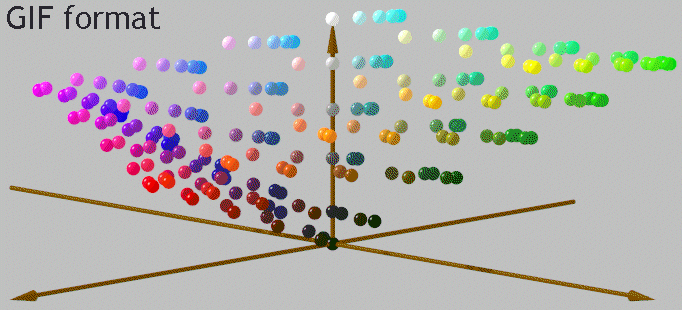
gif: Images that are compressed to reduce the transfer time. Short for Graphic Interchange Format.
example:
jpg/jpeg: A format for compressing image files. Short for Joint Photographic Experts Groups.
example:
png: A bit map graphic format similar to the gif format. Short for Portable Network Graphics.
example:

example:
Note: .tiff images are hard to find so for now there will not be one but here's a failed attempt at an image converted to the .tiff format: example:
jpg/jpeg: A format for compressing image files. Short for Joint Photographic Experts Groups.
example:
png: A bit map graphic format similar to the gif format. Short for Portable Network Graphics.
example:
Subscribe to:
Comments (Atom)